Dependency Explorer
Dependency Explorer lets you explore and visualize dependency relationships between Salesforce metadata components. For any component you select, you can see what it depends on and what other components reference it — all in an interactive tree view.
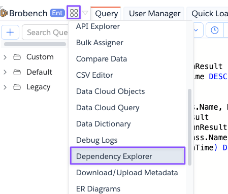
Open this module from App Menu -> Modules -> Dependency Explorer.
This feature uses the Salesforce Metadata Dependency API , which is currently in Beta. It does not support analyzing standard objects or standard fields and doesn't have full support for analyzing dependencies within Flows.
The results may not be 100% complete or accurate, especially for complex components with many dependencies. Use the information as a helpful guide, but always verify critical dependencies manually before making changes based on this data.
If you are using Dynamic SOQL or Dynamic Class Loading those dependencies will not be captured by the API and thus won't appear in the tree.
If an external service is executing SOQLs or managing records directly using standard Salesforce APIs, those dependencies will not be captured by the API and thus won't appear in the tree.
Use this information as first step in understanding your component's dependencies, but always verify critical dependencies manually before making changes based on this data.
Overview
The module opens with a tab-based layout. Each tab runs an independent analysis so you can compare dependencies across multiple components at the same time.
The main area is split into two panels:
- Left — interactive dependency tree for the selected component
- Right — details panel showing component metadata, its direct dependencies, and the components that reference it
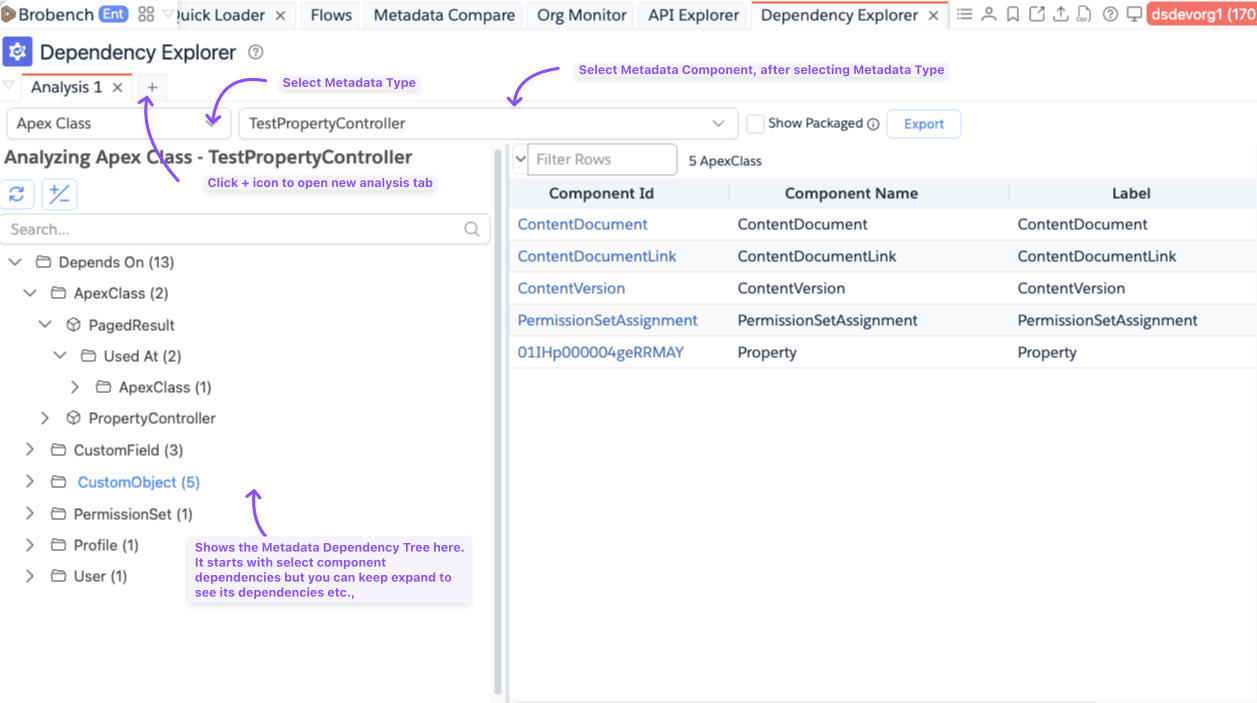
Selecting a Component
Use the controls at the top of the tab to choose what to analyze.
| Control | Description |
|---|---|
| Metadata Type | Choose the type of component to analyze (e.g., Apex Class, Flow, Custom Field) |
| Object | Appears only for Custom Field. Narrows the component list to fields on a specific object. |
| Component | Select the specific component to analyze. Supports search and virtual scrolling for large lists. |
| Show Packaged | When enabled, includes components from managed-package namespaces in the dropdown. |
Dependency Tree
Once you select a component, the tree populates on the left panel. It organizes the component's relationships into two top-level groups:
- Depends On — metadata components that the selected component references
- Used At — metadata components that reference the selected component
Within each group, dependencies are grouped by metadata type. Expand any type node to see the individual components. For large or deep dependency chains, child nodes load on demand as you expand them.
Circular References
If the tree detects a circular dependency (a component that directly or indirectly references itself), it marks that node with a "Circular reference to root node" indicator instead of expanding further. This prevents the tree from looping indefinitely.
Details Panel
Clicking any node in the tree updates the right-side details panel.
| Node Type | What the panel shows |
|---|---|
| Component node | Component metadata (name, label, data type, created/modified info), plus a flat Depends On grid and Used At grid for that component |
| Metadata Type node | A grid listing all components of that type within the group |
| Group node (Depends On / Used At) | A combined flat grid of all components across all metadata types in that group |
The component metadata fields shown (name, label, data type, process type, created/modified by and date) vary by type — only fields that have values are displayed.
Export

Use the Export button to get the dependency data in different formats.
| Option | Description |
|---|---|
| Copy as Tree | Copies the full dependency hierarchy to the clipboard as indented text. |
| Copy as Package.xml | Copies a package.xml containing the root component's Depends On components |
| Download Package.xml | Downloads the same package.xml as a file named package-<type>-<component>.xml |
The Package.xml export covers the direct Depends On dependencies of the root component you selected. It is useful for building a deployment package that includes all components your component relies on.
Working with Multiple Analyses
Each tab in the module is an independent analysis. Use the + button to open a new tab and analyze a different component in parallel. Tabs can be renamed via the tab context menu for easier reference.