Charts
The Charts feature lets you visualize data within the Datagrid to quickly uncover insights.
Available in the Professional edition, this feature works best with the SOQL Datagrid, but it's also supported in other Brobench Datagrids like the Objects list and Fields list.
Supported chart types: Pie, Donut, Bar, Line, Area, Scatter, and Bubble.
Usage
-
Open the Charts dialog by clicking the
Charticon in the Query Datagrid, or by right-clicking any Datagrid and selectingGrid Actions -> Chart.Keep in MindThe
Charticon appears only in the Query Datagrid, but the right-click option is available in all Datagrids.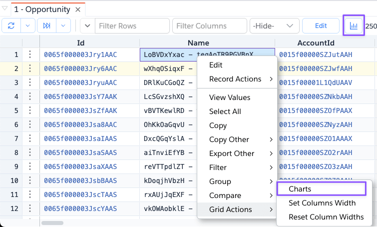
-
The chart dialog opens with a blank chart widget by default.
-
Hover over the widget to reveal chart controls.
-
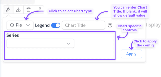
Click the
wrenchicon to openChart Options. -
Configure chart type, series, and other settings.
-
Click outside the dialog or press
Applyto close it and render the chart.
Chart Basics
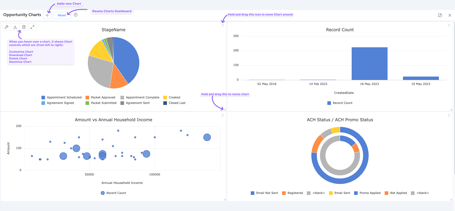
Dashboard
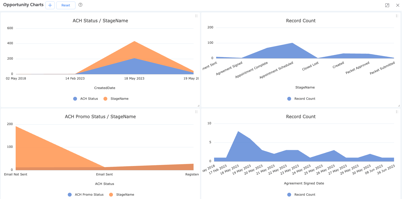
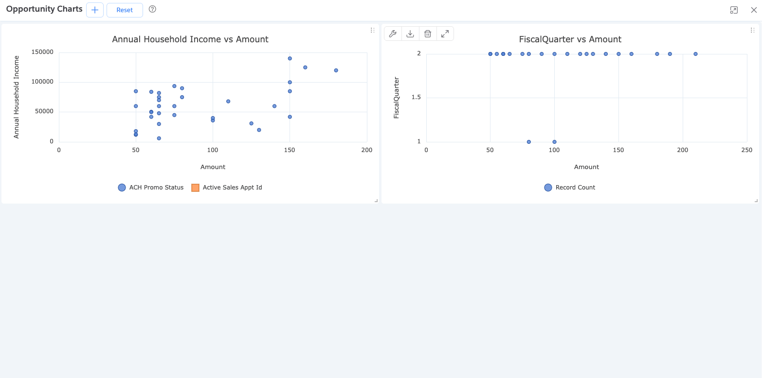
The Charts dialog, also called the Dashboard, allows you to view multiple charts at once, making it easier to explore various aspects of your data.
Data Source
Charts are based on the current records available in the Datagrid.
If your query matches many records (e.g., 10,000) but only a subset is fetched (e.g., 2,000), charts will be based on the fetched subset. To visualize all records, fetch them before opening the Charts dialog.
Chart Controls
Each chart widget has a set of controls, visible when you hover over it:
| Control | Description |
|---|---|
| Chart Options | Opens the configuration panel |
| Export Chart | Downloads the chart as an image file |
| Delete Chart | Removes the chart from the dashboard |
| Maximize Chart | Expands the chart to fill the dialog space |
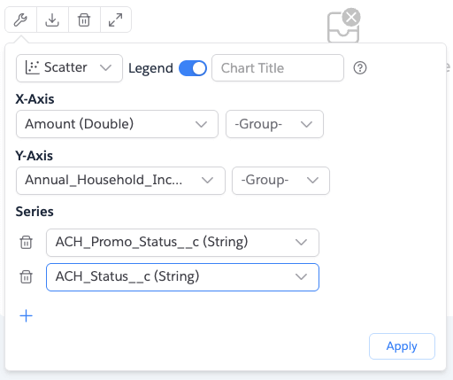
Chart Options
Each chart has its own configuration, accessible via the wrench icon.
Common chart settings include:
Legend
The legend helps interpret chart colors or patterns. It's shown by default at the bottom but can be turned off in the options.
Grouping
Data can be grouped by numeric or date/time fields, typically on the X or Y-axis. Default groupings:
- Date/Time:
Day - Numeric:
Tens
Series
Series represent the main data elements. Most charts support multiple series except Pie, which supports one. Non-numeric fields are converted to numeric values when used.
X-Axis
Used for categories, time, or numeric values. Grouping levels can be applied for better readability. Not applicable to Pie and Donut charts.
Y-Axis
Represents numeric values or counts. Grouping options are similar to the X-axis. Not applicable to Pie and Donut charts.
Add Chart
Click the Plus icon at the top of the Charts dialog to add a new chart widget.
![]()
New widgets appear either beside or below existing charts based on available space.
- Charts may be added below the visible area. Scroll if needed.
- There's no hard limit on the number of charts, but screen space and system resources may affect performance.
Reset Dashboard
Click the Reset button to remove all charts and start fresh with a blank chart.
![]()
Chart Actions
Hover over a chart to access controls in the top-left corner.
Chart Options
Click the wrench icon to open the options panel. Available settings vary by chart type.
Download Chart
Click the download icon to save the chart as a PNG image.
Delete Chart
Click the trash icon to remove the chart. This action is not reversible.
Maximize Chart
Click the expand icon to maximize the chart. Use the collapse icon to restore its size.
Chart Types
Brobench supports several chart types tailored for different data needs:
Pie Chart
A circular chart where each slice shows a category’s portion of the whole.

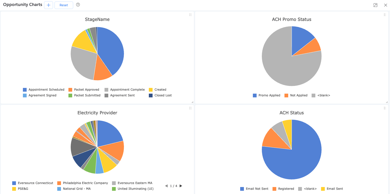
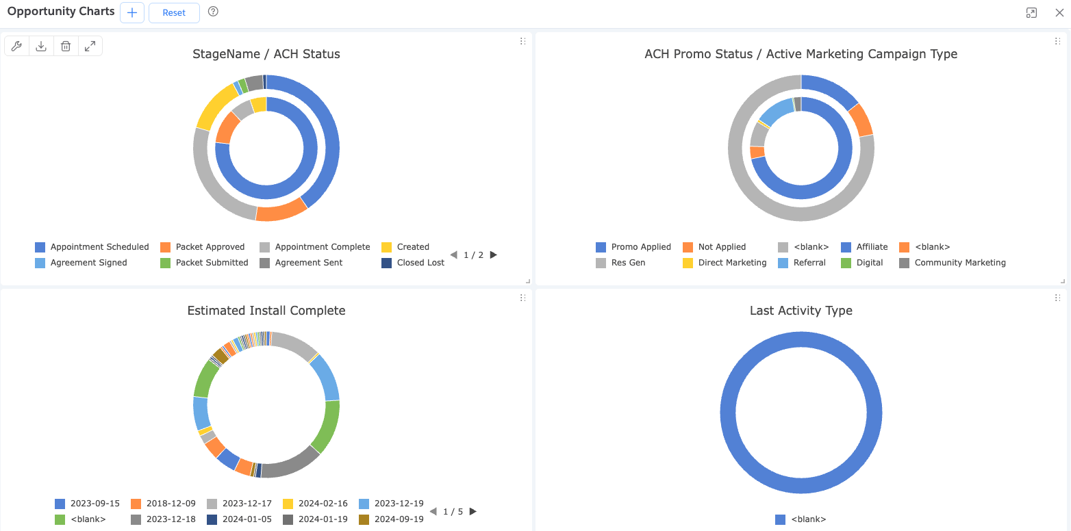
Donut Chart
Similar to Pie but with a center cutout. Allows better readability and supports multiple series.

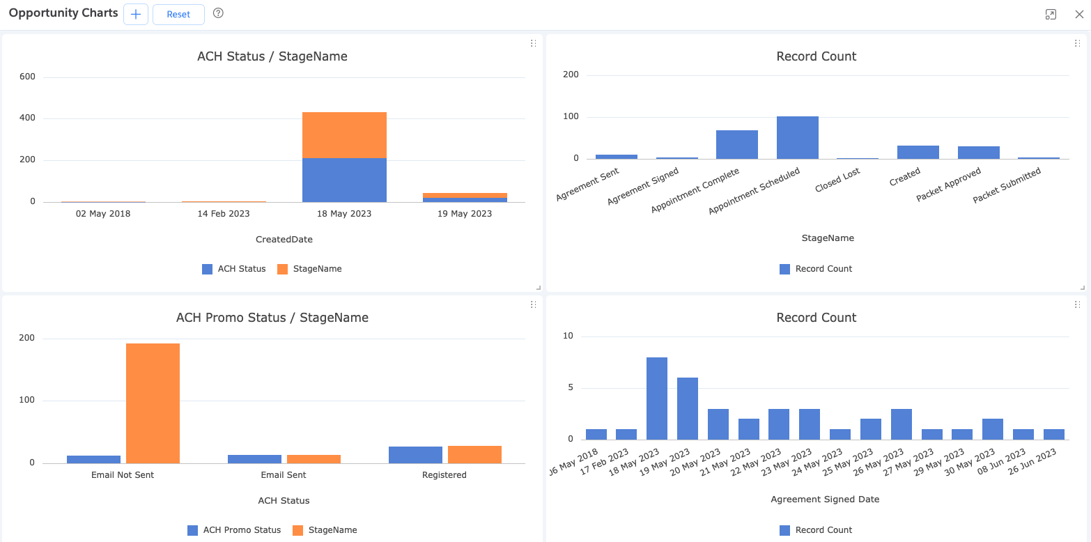
Bar Chart
Displays values across categories using horizontal or vertical bars. Useful for comparisons.

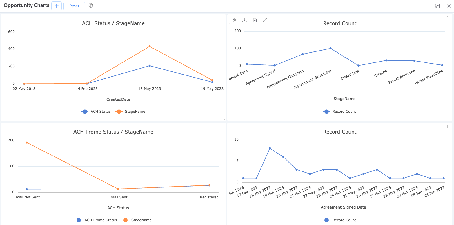
Line Chart
Connects data points with lines to show trends over time or ordered categories.
Area Chart
Similar to Line Chart but with the area beneath the line filled. Shares options with the Bar chart.
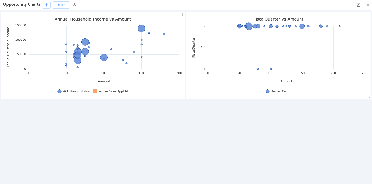
Scatter Chart
Plots data as individual points on an X-Y grid. Great for exploring relationships, clusters, and outliers.
- Compare variables (e.g., height vs. weight)
- Identify clusters or trends
- Spot anomalies
Bubble Chart
A Scatter Chart with a third dimension. The bubble size reflects an additional value.
- X-axis: first variable
- Y-axis: second variable
- Size: third variable (e.g., revenue or volume)
Commonly used for multi-metric comparisons and to emphasize impact.